


Signs matter
We can learn a lot about the city by what it displays

September-October 2022
Our public spaces are full of visual information that tell us about the city. There are signs for stores, for directions and regulations, and currently for candidates in an election. There’s public art, unofficial and official. There’s lettering that identifies buildings, and engravings on tombstones that memorialize our predecessors. They tell us that the city is inhabited – by people, by commerce, by beauty, by memories. They are a way of reaching out, of communicating across space and across time, of affirming a belief that connection is possible and essential. All of them, even the memorials for the departed, help bring the city to life.
The Sneak Peek
Signs speak to, and about, a city. They can often help define it – think of Broadway or Las Vegas. They also tell you about it – its history, its activities, its population. Earlier this month, I had the pleasure of copyediting Spacing’s upcoming book on the history of Toronto signs, The Signs that Define Toronto, co-edited by Matt Blackett with Kurt Kraler and Phil Evans of heritage specialists ERA Architects.
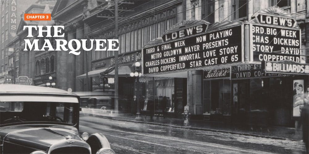
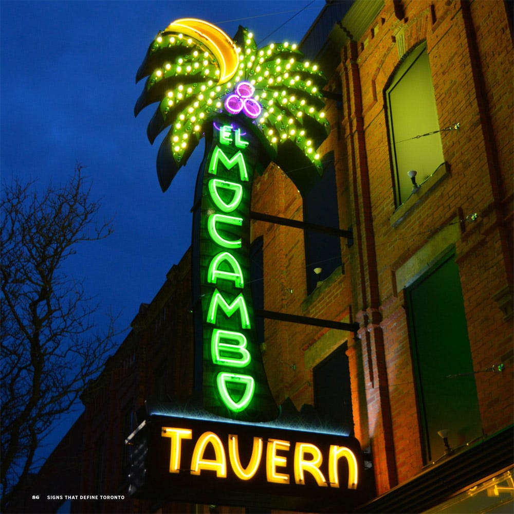
It’s a wonderful trip through a century or more of signage. It includes Jamie Bradburn writing about movie marquees, John Lorinc writing about neon (best chapter title: “Creating all kinds of buzz”), a wonderful excursion into the world of the “wall dogs” who painted the ads on the sides of buildings that still survive (thanks to the toxic but durable lead paint they used) as “ghost signs,” and explorations of the role of signage in communities like Little Jamaica and Toronto’s Iranian diaspora, “Tehranto.” Plus of course coverage of essential Toronto signs that have been displaced or disrupted, such as Sam the Record Man, Honest Ed’s, and El Mocambo.
Meanwhile, Toronto is in the midst of an ephemeral blossoming of signs, thanks to the city election. I’ve always loved the plethora of lawn and window signs that accompanies an election, and I wrote some thoughts about them on Spacing Toronto:
The Tidbit
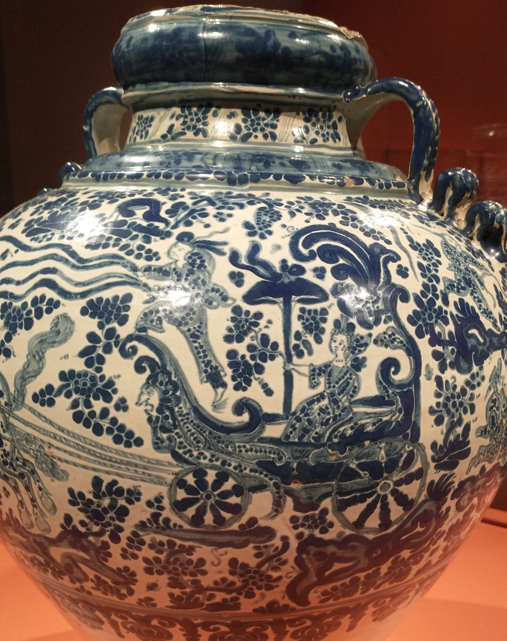
Earlier this year, I copyedited a couple of books about early modern global history, and was introduced to the Manila Galleon – a trade route developed by the Spanish colonial empire between the Philippines and Mexico, bringing Chinese and other Asian goods to the Americas (and Europe) in exchange for precious metals and jewels.
So it was really interesting to visit the Art Gallery of Ontario’s exhibit “Faith and Fortune: Art Across the Global Spanish Empire,” and see an example of Mexican craftsmanship influenced by the Chinese porcelain brought to the Americas by that route. I also particularly loved that it portrays a woman (goddess?) on a triumphal chariot, echoing the carnival and royal entry celebrations I’ve studied in France. A fascinating mix of cultures – Asian, Mexican, and European – coming together.
What’s Up
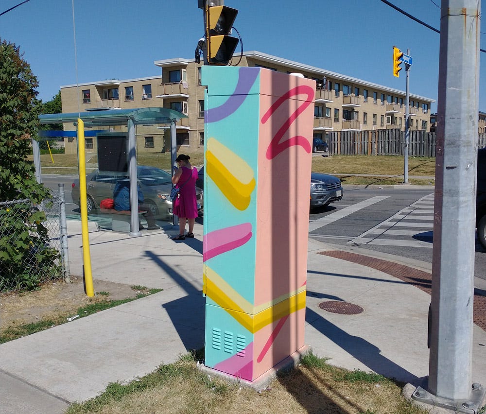
For the past few years, the obscure grey signal control boxes that lurk at the edge of every set of Toronto traffic lights have been undergoing transformations into little three-dimensional artworks. The Outside the Box program brings colour and whimsy into the city, and contributes to what I call messy urbanism – making the city a little more random and interesting. I’ve wanted to learn more about the program and share my enthusiasm for a long time, and this summer I was able to pitch the Toronto Star on a feature.
In July, I drove to an intersection in northern Etobicoke to interview the artist Leyland Adams about his Outside the Box project. I’d pushed to feature a project in the suburbs, because there’s a lot of attention to downtown public art, but it can make an even bigger difference in the suburbs. Leyland agreed – a couple of times, he talked about how oft-neglected communities felt valued when, as he quoted them saying, “they gave us the good art this time.” It may be whimsical, but it makes a real difference.
Read my article in the Star: Thanks to Toronto’s Outside the Box program, hundreds of traffic light boxes have been transformed through vibrant paint jobs
Quotable
"Having the people from high school, from when I started doing art - I was just a little mischievous kid, a lot of people knew me like that, and to see like, man, you went from just like tagging and doing this art that people said was bad, or that may have got you into trouble, to people see me on a bus, they're like, 'dude, I saw your bus! I saw your sign at Greenwood Station! Like yo, sick.’"
- Leyland Adams
My interview with Leyland at the traffic signal box at Kipling and Westhumber went for more than an hour and a half, and I could only squeeze a tiny part of the fascinating conversation into the article. One of the most moving parts was his emotional description of what it meant to him to have his mural of Nelson Mandela wrapped around a TTC bus for Black History Month 2022.
Pic Pick
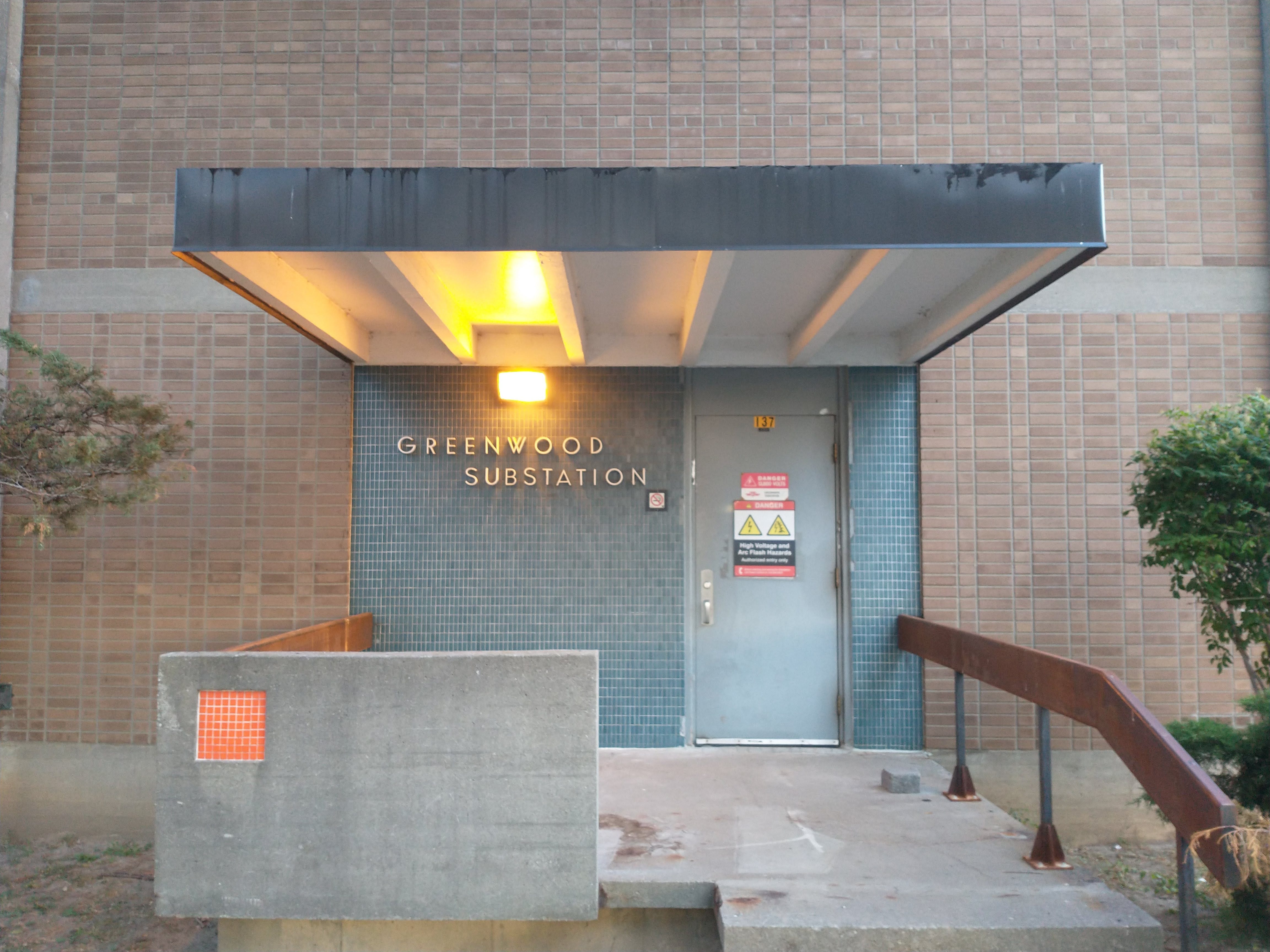
In the Spacing book Remnants of Mid-Century Toronto, I wrote about how the mid-century attention to design even on mundane pieces of infrastructure revealed a commitment to the importance of public infrastructure in our cities. That’s captured so beautifully a few blocks from where I live, where this simple substation got a beautiful sign and design. It makes me happy every time I walk by it, and I was able to capture it in this photo.
My friend and Spacing colleague Shawn Micallef recently wrote about why putting effort into the design of our public spaces is important. As he says, echoing Leyland Adams’ observation, “Beautiful, well-made things tell residents and visitors that the place matters.”
The Catch-Up
Imagine discovering that the flagstones in your front garden have, all this time, had Hebrew script carved on their underside. It happened in Harbord Village, and Erica Simmons wrote a delightfully intriguing article for Spacing puzzling out the story, all the while delving into Toronto’s Jewish history and burial practices.
So intriguing, in fact, that the article has been nominated for a Heritage Toronto people’s choice award (though unfortunately only attendees and donors can vote). It’s always a thrill when an article you edited is nominated for a prize. Although, honestly, Erica’s article (writing as Beth Simons – but it’s ok to reveal her secret identity now) barely needed any editing at all.
Read History on the Rocks
The Shout-Out
My friend Derek Neal – a friend since Grade 9 – is not only a professor of history at Nipissing University, but also an Anglican minister with a couple of small northern parishes. As if that’s not enough, he has also taken up composing, and recently enjoyed the thrill of seeing one of his pieces performed live (thanks to a composition summer school he took part in)! It’s a seven-minute trio for flute, piano, and cello called “The Hedge,” inspired by the birds singing in the hedge outside his house. Have a listen!
Listen to The Hedge (YouTube)