

Contrast
Contrast
From the sharp delineation of sunlight and shadow to the soft blur of rain, with stops for colour and street art along the way.

April 2022
I never start a newsletter with a theme in mind, but often a theme emerges after I put the content together. This month, “contrast” jumped out at me (so to speak) – both its presence and its absence. The sharp contrast of sunlight and shadow. Contrasting styles of street art side by side. Colours, meanwhile, bleed into one another, challenging the attempt to set clear boundaries between them. And rain softens all contrasts – but at the same time, it contains contrasts within it, being at once a nuisance and a necessity, a challenge and a balm.
The Sneak Peek
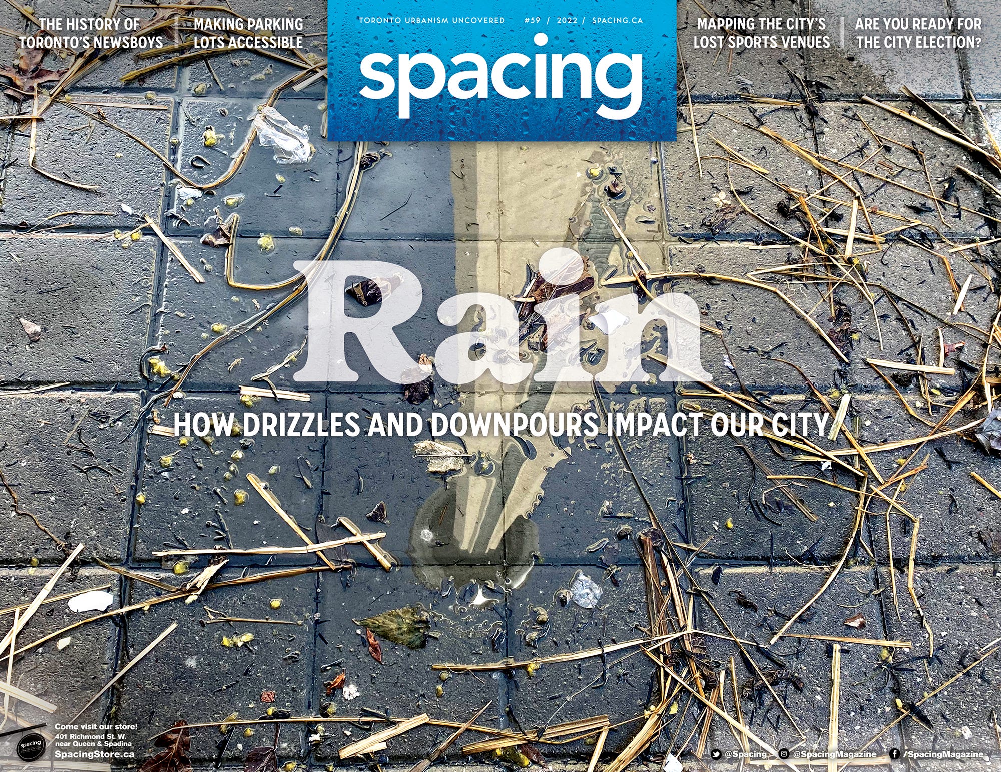
Chances are you’ll curse the rain sometime this spring, if you haven’t already. The cover section of our next issue of Spacing is all about rain. When I started thinking about the issue, I started to realize just how fundamentally rain shapes our cities – in many ways, literally. We shape our buildings to slough it off, we slope our streets to drain it, and we’ve built a vast underground maze of tunnels beneath our feet to gather it and send it to rivers, lakes, or oceans. But at the same time, we need rain and try to gather it for our gardens and parks, while cities less lucky than Toronto (with its shore on a vast inland sea) need it for the aquifers that supply the water they use for drinking, manufacturing, cleaning, and so many other necessities of life.
Our issue explores some of these themes – how we manage rain, how we conserve and use it, and how it can disrupt the city through flooding and pollution. I’m particularly pleased with how the cover section mixes graphics, maps, and different types and lengths of articles into a really interesting spread. Coming soon to a magazine rack or mailbox near you!
The Tidbit
I have a hard time getting my head around the idea of a language without a word for “blue” – after all, what colour is the sky? But apparently quite a few languages don’t have one (they usually combine it with green) – and that tendency, a study suggests, is shaped by the environment. Languages in places with more sunlight are less likely to have a word for blue, while places near lakes or that developed blue dyes are more likely to.
But the emergence of spring flowers brings a reminder that I get teased by my wife because I tend to conflate blue and purple when describing the colour of some of their blooms. The line between colours really is arbitrary – they literally bleed into each other. We think of our perception as so clear, and yet it is so contingent. The wavelengths are constant, but we all see them in our own way.
Quotable
“No greater hurt, grievance, or damage can be done to any man’s Freehold, than to take away the light and air thereof.”
“The more buildings, the more populous and honourable will [this city] be. And therefore Building is to be favoured.”
These quotes are from opposing lawyers in a sixteenth-century lawsuit, but they echo arguments still happening today. I’ve always been interested in the historical context of current events – it’s a way of connecting my longstanding study of history with my engagement with modern issues around cities. Last year, looking into the history of “messy urbanism,” I read the book Hubbub: Filth, Noise, and Stench in England, 1600-1770. Among the many fascinating tidbits in the book was a reference to a lawsuit over the right to sunlight – someone sued their neighbour because the neighbour built a house that blocked sunlight from the plaintiff’s windows. I was intrigued, because arguments about sunlight and shadow are a big issue of discussion around development in modern Toronto, as new and taller buildings spring up in established neighbourhoods.
I dug into the references, and it turned out that this centuries-old lawsuit is preserved in a seventeenth-century book that is now online (the miracles of modern historical research!). So I wrote up a Spacing post online exploring the arguments those historical lawyers deployed about sunlight and shadows, and how some of those arguments resonate today when people want to build beside other people’s property.
Pic Pick
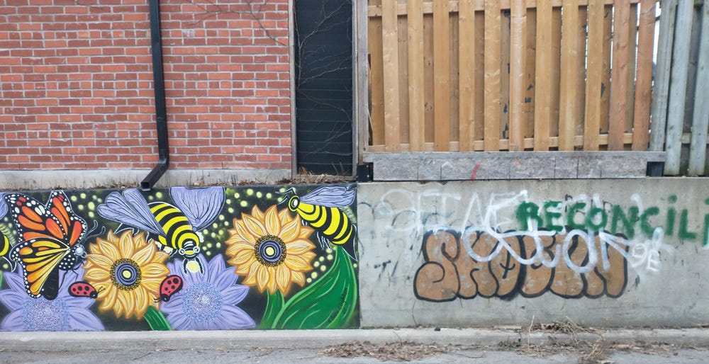
This photo I took on a neighbourhood walk near Monarch Park captures an unusually dramatic contrast between types of street art. On the one side, a beautiful mural; on the other, tags and bombs. It shows how a dull, grey, blank wall invites intervention, and how putting some effort into making it interesting brings rewards not only aesthetically, but also in who gets to decide how the space is used (graffiti artists will generally not tag a fellow-artist’s work). But at the same time, the anarchic, overlapping tags on the blank wall have their own energy, and their own message in the assertion of individual agency and political goals (“reconciliation”).